Community Health Centers:
It’s time to tune-up your performance
Many CHCs are now sharpening their visual identity, brand positioning, and website performance.
WHY:
- Boost patient acquisition
- Shift the payer mix
- Build B2B/ACO partnerships
- Increase website engagement and conversion
“Upgrading our positioning, message, visual identity and website performance has enabled Optimus to compete with major health systems.”
Karen Daley
CEO, Optimus health care

PROFILE
A 50+ year CHC evolves into a competitive health system
- Optimus Health Care is the largest primary care provider in SW CT – 35 facilities providing a full spectrum of care, including dental and school-based care.
- New leadership wants to steer Optimus toward a more contemporary, competitive, positive presence in and outside its core communities.
- Drinkcaffeine is taking them there. Here’s what we did.
Elements
Positioning
Not a CHC, but a competitive health system
“Optimus is a health system that offers a lifetime of care”
- Based on input from leadership and market research, we moved Optimus forward from an assortment of 35 CHC facilities to a single, coherent health system.
MESSAGE
Defining the Optimus value proposition
“A lifetime of care from a patient-centered health system”
- For patients, providers, stakeholders and partners, the Optimus message is about longevity, community presence, and patient focus.
LOGO
Evolving to greater sophistication
- Concentric circles: To convey community
- Vibrant, life-affirming colors: Signature colors are used throughout all materials.
- Cleaner, contemporary design and font: Communicates an advanced, sophisticated brand of health care.
- Versatile: The logo works equally well in all media – including signage
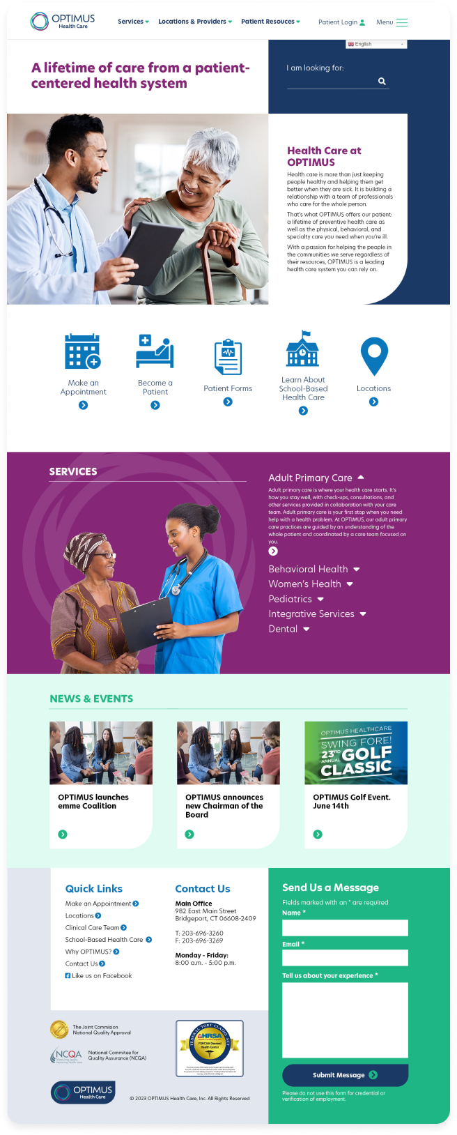
WEBSITE
Fast, intuitive, and easy for anyone to use
- Clear message delivery: A lifetime of preventive health care.
- Site search front and center: Prominent search area with clear translation box.
- Conversion pathways are clearly marked: Visually dominant options for appointments, new patients, forms, locations, and school-based health.
- Primary Care Services easy to access: Scrollable access to core primary care content areas – with a clear explanation of the category.
- Logo color saturation: Use of branded logo colors throughout the site
- Message form: Simple, visible, and positioned at correct scroll depth
- 100% HIPAA compliant: Zero patient identity exposure
Precisely crafted positioning, messaging, visual identity, and website performance are the keys to healthcare website conversion.